Case study

Wild Otter App 2024

The challenge

Paddlers and wild swimmers have always relied on a patchwork of resources to plan their adventures. Paper guidebooks go out of date the moment they reach print; access notes live in scattered Facebook groups; river levels, tide times and water-quality readings sit on separate government websites; and hazards reported by other water users rarely make it back to the people who need to know. The community had grown, but the tools serving it had not kept pace. 

Wild Otter came to Shoothill with a clear ambition: to build the definitive digital resource for recreational water users, an app designed by paddlers and wild swimmers, for paddlers and wild swimmers, that would consolidate every piece of information needed to plan, paddle, swim, explore and report, all in one trusted place. To do this, the product needed more than software. It needed an identity. Wild Otter would be entering a category dominated by either utilitarian government data feeds or hobbyist forums, and it had to feel different, friendly enough to invite a beginner in, credible enough for an experienced paddler to rely on, and distinctive enough to build a community around. Shoothill was challenged to deliver both: a brand identity that captured the spirit of the outdoors community, and a mobile app that lived up to the promise of being the one resource these users would reach for every time they headed to the water.

Our solution

Shoothill approached Wild Otter as a single, joined-up project, brand, product and app design developed in step, so that every screen, icon and word felt unmistakably part of the same thing. Rather than creating a logo and handing it to a separate development team, our designers and developers worked together from the first concept sketches through to App Store launch, ensuring the personality of the brand carried into the smallest interaction details. 

The visual identity was built around a single, confident piece of mark-making: an otter formed from a curling wave of water, drawn in one fluid line so that the animal and its environment become inseparable. The mark works as a full lock-up with the WILD OTTER wordmark beneath, and as a standalone symbol at app-icon size, retaining its character whether it appears on a launch screen, a printed flyer or a social avatar. We chose a tonal blue palette, a deep marine blue, a brighter mid blue and a pale sky blue which gives the brand depth and movement without ever feeling cold or corporate. Combined with a clean, widely-spaced sans-serif wordmark, the result feels modern and editorial rather than sporty or technical, deliberately positioning Wild Otter alongside the publications and outdoor brands its users already trust. 

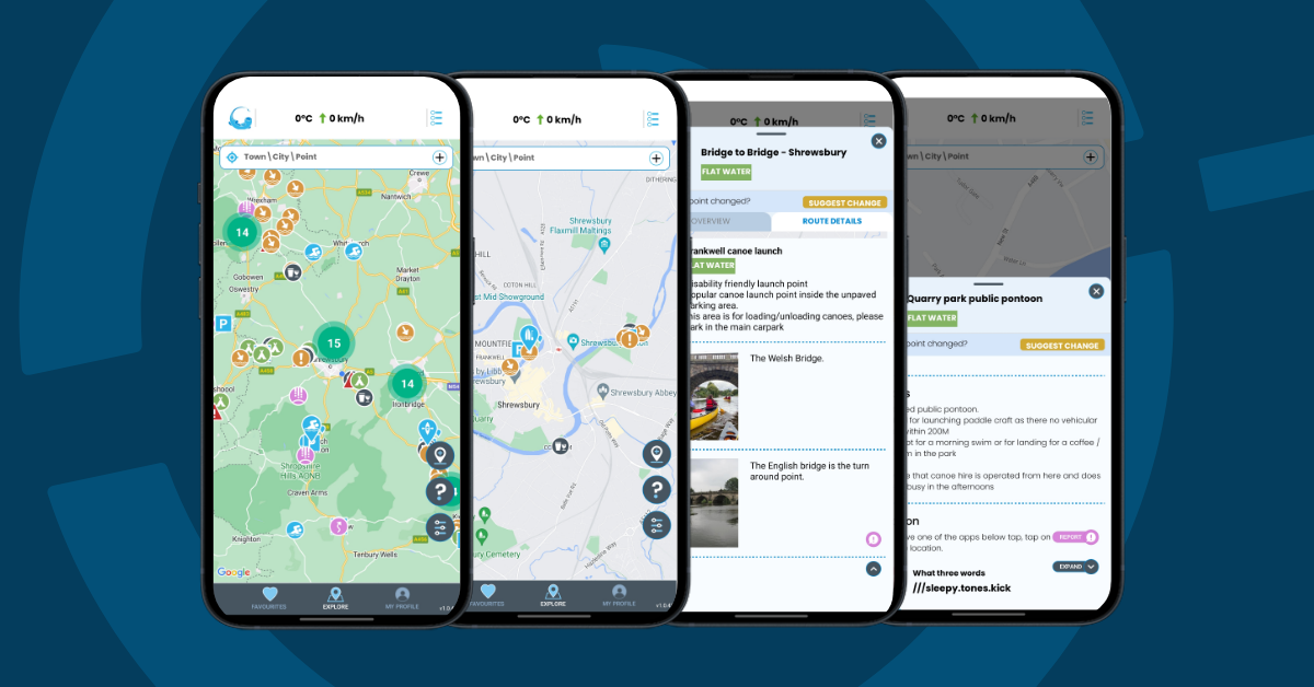
That same restraint carries into the app itself. Wild Otter is, at its heart, a content-rich product, a map of locations, each with photographs, comments, ratings, access notes, public transport routes, live and forecasted river gauges, water-quality readings and tide times, so the interface had to serve information without smothering it. Our UI designers built a calm, photography-led layout where user-submitted images of rivers, lakes and coastline become the visual texture of the app, and the brand’s blues are reserved for navigation, calls to action and live-data indicators. Hierarchy is established through generous spacing and considered typography rather than heavy chrome, so that whether a user is checking conditions on a familiar stretch of river or scrolling somewhere new, the screen always feels uncluttered. 

Four core experiences sit at the centre of the product: Paddle or SwimExploreReport and Plan. Each was designed as a distinct user journey but built on shared components, the same map, the same location card, the same media viewer, so that the app feels coherent end-to-end. Explore lets users discover spots through community comments, ratings, photos and video, with filtering that feels closer to a travel app than a piece of utility software. Plan brings together everything a water user needs before they set off: access information, transport links, live and forecasted river gauges, water-quality readings and tide times, all surfaced on a single location page so there is no app-hopping in the car park. Report gives users the ability to flag hazards and litter on their favourite waterways directly to the Wild Otter team, who either organise a clean-up or assess the hazard themselves; live notifications then let other users know when a new hazard has been logged on a location they follow, or when one has been cleared. The result is a moderated, trusted information loop, community-powered, but quality-checked, which is the foundation of Wild Otter’s value proposition. 

Underneath the design work, the app was built and shipped natively for both iOS and Android, available in the App Store and on Google Play, with a subscription model that gives users access to the full library of routes, swim spots, points of interest and river-level data. Account management, location moderation tools and live data feeds were all integrated into the app’s back-end, with personal data encrypted in transit and a clear data-deletion route, in line with current Google Play data-safety expectations. A complementary marketing site at wildotterapp.com was designed in the same visual language, giving Wild Otter a consistent presence from the first Google search through to the moment a user opens the app on a riverbank.


Conclusion

Wild Otter launched as a fully-formed product: an identity, a marketing site, and a live iOS and Android app, all designed and built by Shoothill. From the moment a user encounters the brand — whether on a social post, the website or the App Store listing through to opening the app and dropping a pin on their next swim, the experience is consistent, considered and unmistakably Wild Otter. The otter mark has proven flexible enough to carry across every touchpoint, from app icon to merchandise, while the calm blue palette and photography-led UI give the product the editorial, outdoorsy feel its audience responds to. 

For Wild Otter, the project delivered more than a piece of software. It delivered a brand they can grow into one that already feels at home in the wild swimming and paddling community, and one that gives them a credible foundation as they expand the app’s content library, geographic coverage and feature set. Early users have used the app to find swim and paddle spots while travelling, taken comfort in knowing the team checks points regularly so information stays current, and treated the subscription as a worthwhile investment in their adventures. 

In summary, Shoothill delivered a unified brand and product story for a community-driven app entering a fragmented market. We translated a clear ambition  “the resource for paddlers and wild swimmers everywhere to plan, paddle, swim, explore and report” into a visual identity, a content-led mobile UI and a shipped cross-platform app, and we continue to support the product as it evolves. We will keep iterating on Wild Otter alongside its team, expanding features, refining the design system and adapting the app to emerging technologies, and we are actively exploring further opportunities to grow the product with them. 

“The resource for paddlers and wild swimmers everywhere to plan, paddle, swim, explore and report.”  Wild Otter 

As a result of this work, Shoothill has demonstrated: 

The ability to develop a complete brand identity from scratch from logo and palette through to wordmark, tone and supporting visual language  for a consumer-facing product entering a competitive category. 

The design skills to translate a brand into a content-rich, photography-led mobile interface that feels editorial rather than utilitarian, and that scales gracefully across iOS and Android. 

The capacity to deliver a fully-shipped cross-platform app with integrated live data, user-generated content, moderation workflows and a subscription model. 

Continued support of clients after launch, with ongoing iteration of both the design system and the product itself.