
In the years leading up to our development of Gaugemap, Shoothill had received much commercial and media attention. This attention was regarding our proven ability in translating flood data to a digital format with the development of our FloodAlerts.com platform which was used by the Environment Agency, the BBC and Sky News amongst others.
Our work with government bodies and the private sector established us as an authority on manipulating environmental data. As a result, we now had the opportunity to capitalise on a wealth of Environment Agency live river gauge data.
We challenged ourselves to develop a visualisation of the 3000 nationwide gauges displayed in a cutting edge web application system, funded by the government’s Innovate UK grant. We were looking to create a go to point of information for the UK public during flooding and extreme weather conditions.
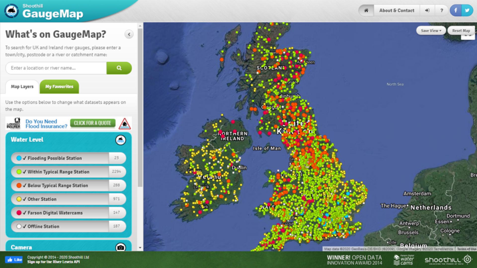
Gaugemap was the outcome of this project. A live mapping system for thousands of river level gauges. This system was openly accessible through a web portal. Using Google Maps integration, we were able to display data from each gauge on a single interactive map with pins that changed colour based on the gauge state – allowing a user to gain an holistic overview of the UK situation in seconds.
Sensors from over 3000 gauges fed data into our system. Our talented developers were able to manage this wealth of information on our servers and databases.Gaugemap manipulated this data and visualised it in an easy to understand format.
A priority for Gaugemap was to ensure the system was free and accessible to a wide audience. To achieve this, we designed a sleek and user-friendly web portal. This site housed the interactive map on which each gauge was placed.
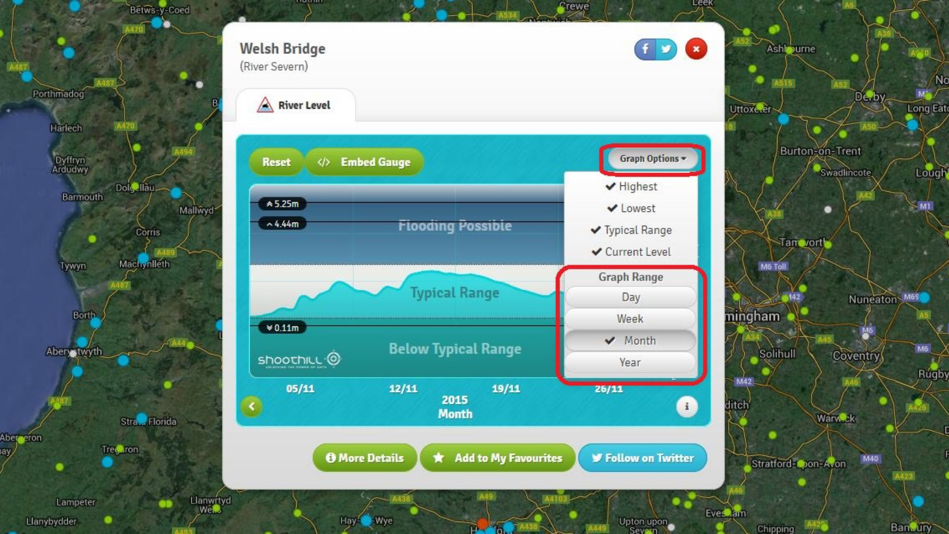
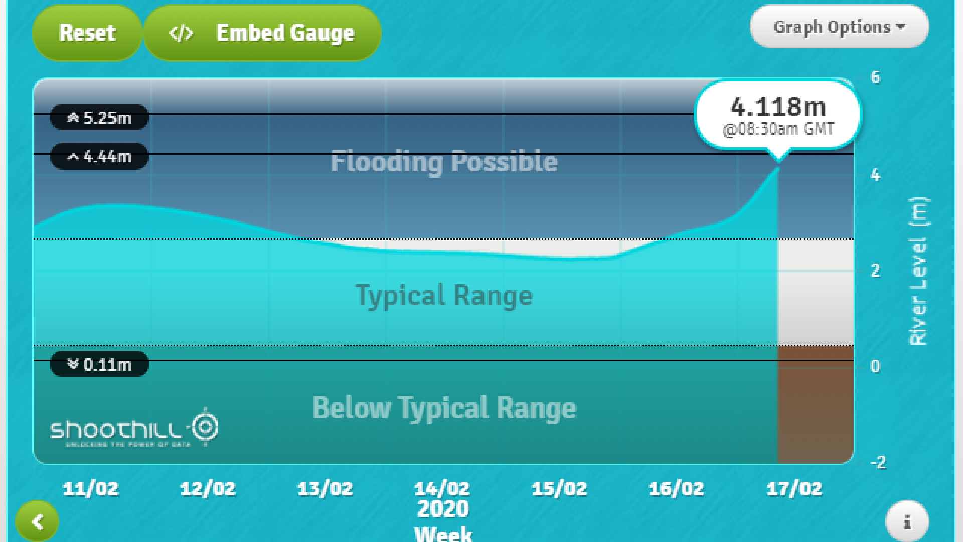
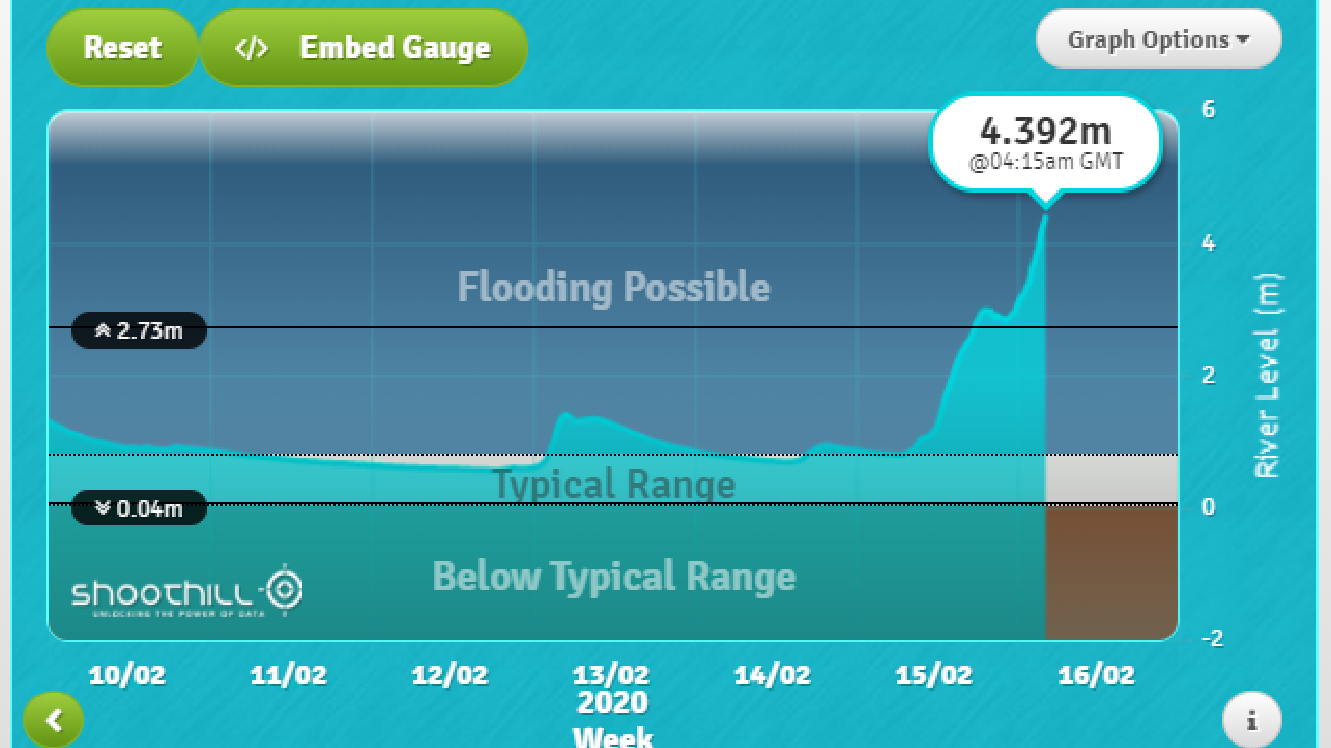
River levels recorded by the gauges could be graphed in real time. These graphs could also be modified by the user to show other data, such as throughflow rate, and track the course of different rivers. For comparison, historical milestones are indicated against the current levels; all time and recent records based on data from the Environmental Agency.
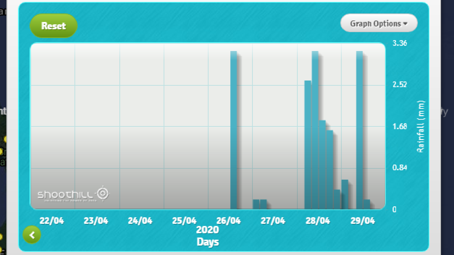
The site also contains information on rainfall, groundwater levels, and photographs from the stations. Each station is colour coded to indicate what data it provides. The colour code system also gives at-a-glance insight into which stations are recording average, higher, or lower levels.
We also explored further ways to distribute the data and help it reach a larger audience. One such approach was the creation of over 3000 automated Twitter accounts. This was more than any firm had created for any project in the past and the system has now tweeted over 7 million times!. Each software robot corresponded with a specific gauge station. Multiple times a day the accounts tweet out their river level graph, informing all followers of the current data.
Additionally, we designed and developed a widget for the graphs. Every gauge’s data could be embedded and displayed graphically on other sites. This way the information can be distributed to relevant parties, with live updates.
On the Gaugemapsite users can search for relevant stations and favourite any which they need regular updates from. Between following the gauges on twitter, utilising the personalisation options on the main site, and displaying data from stations on their own website, users have access to all manner of useful resources.
When released in 2014, Gaugemap was the first of its kind across the United Kingdom. Before this project, there was no tool for nationwide analysis of river levels. By filling that niche, Gaugemap was able to deliver a new level of insight into environmental data across the country.
The effectiveness of this project was reflected in the millions of hits the site earned in it’s first year. Many of the twitter bots received many followers, looking to capitalise on the valuable local information.
Ultimately the portal provided an unparalleled and much demanded level of information in this key area. In particular, Gaugemap could prove very useful for any people or organisations whose activities took place around bodies of water and were thus affected by any flood conditions. Not just providing immediate feedback, Gaugemap helps a user gleam an understanding of how the situation will evolve by illustrating the rate of change of river flow.
Shortly after release, the site was honoured with the Open Data Institute’s inaugural Innovation Award. It was our honour to receive this award from Tim Berners-Lee, the inventor of the World Wide Web.
Countless sites have embedded graphs from the tool and rely on its output. Even now, years on from the project’s completion, the site is still active and functional, yielding countless hits, with many groups still reliant on the free data visualisation it offers.